Your safety dashboard
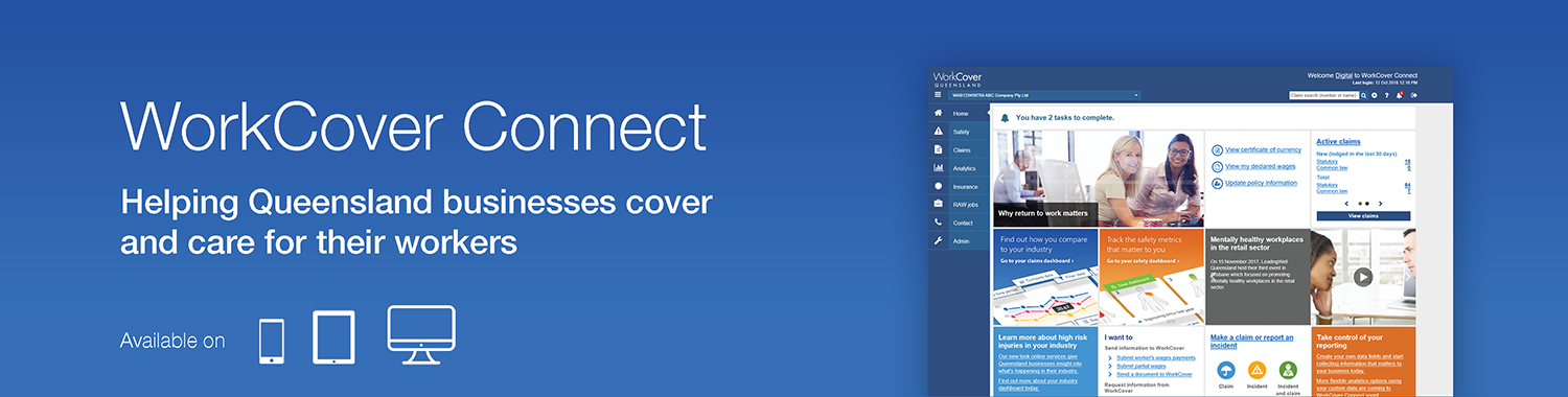
The WorkCover Connect safety dashboard provides insight into injury and claims trends for your business. We've been listening to your feedback since we launched the first safety dashboard in 2016, and rolled out a number of improvements in that time to make it even more powerful for your business. Now we're ready to show you our most powerful update yet.
What's in the safety dashboard?
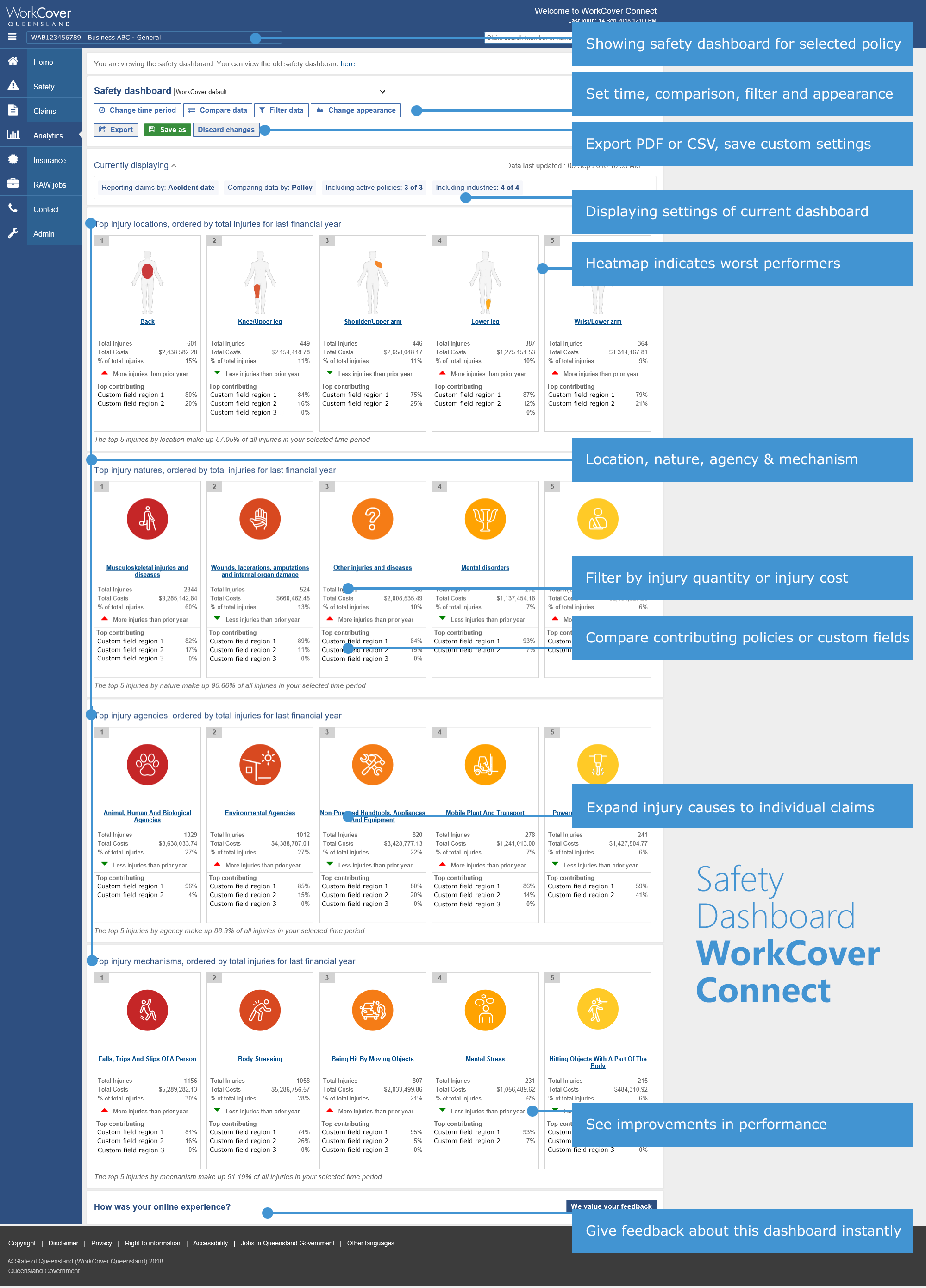
The safety dashboard shows the 5 most common injuries in 4 sections, showing trends for the following:
- injury location (the part of body injured)
- injury nature (the type of injury)
- injury agency (what caused the injury)
- injury mechanism (the action or event that resulted in the injury)
To see how your business is tracking, login to your WorkCover Connect account or register for WorkCover Connect.
What's new in the safety dashboard?
Employers told us that the safety dashboard was a useful tool to understand the injury patterns within an organisation, providing guidance to prioritise budget requests and training initiatives. We've focused on expanding the charts and safety human, and streamlined the path from top level trends to individual claims.
New features in this update include:
- Injury human heatmap
- View trend over time data for injury locations, mechanisms, agencies, natures
- See 5 worst performers for injury locations, mechanisms, agencies, natures
- Change between injury cost and injury count
The safety human
To see injury trends at a glance, the safety human has been expanded to include the 5 most common injuries presented as a heatmap on summary cards. Each card represents an injury location on the safety human, showing the following quick glance data based on your dashboard settings and volume of claims data:
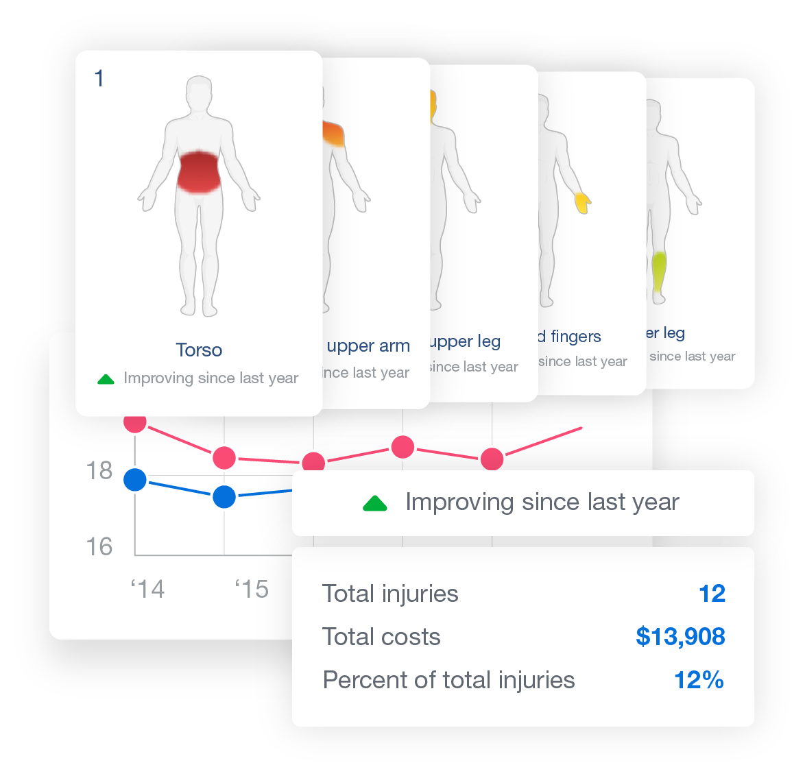 |
To see the claims that impact the trends, drill down from the safety human to a more detailed view, or all the way to individual claim level. |
Custom field support
If you're already using custom fields and have data against these, you'll see the flexibility of the new dashboard already. A comparison dashboard can be created and saved for any custom field setup as a drop down with multiple values. These values can be compared against each other in the new claims and safety dashboards.
Reporting measures
To make the most of the new employer tools, we've standardised some aspects of how we report claims data across the various sections of WorkCover Connect. Employers using the existing reports may notice slight changes such as when the claim expenses are reported. Costs can now be analysed either by date of accident or the date of registration of the claim.
Using the new dashboards
The flexibility of these new features means there's endless combinations of how you can use the dashboards. We encourage you to click around on the new features, change some settings and see how this impacts the graphs and charts. A quick guide is available for some of the new features of WorkCover Connect. If your question isn't answered there, please browse the pages below or contact your relationship manager for support to get the most out of the new dashboards.