Your claims dashboard
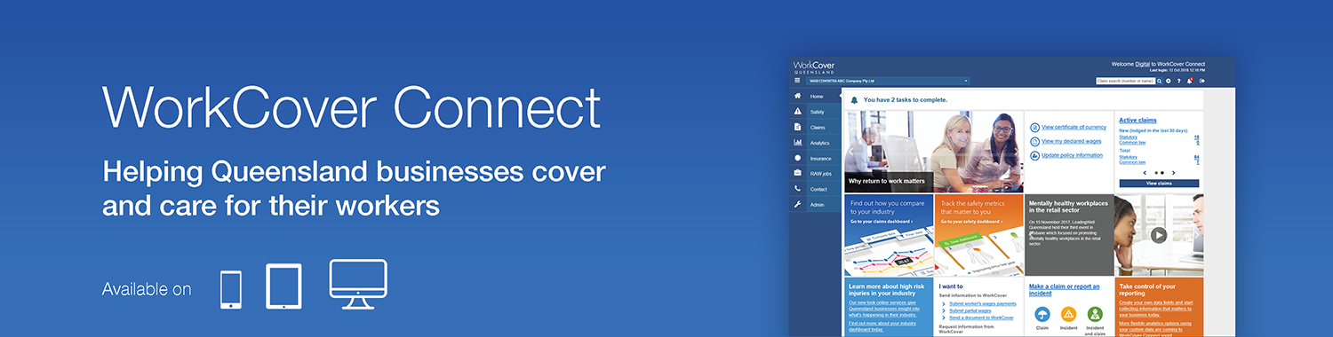
Accessible from within the analytics menu in WorkCover Connect, the claims dashboard is where you go to explore data about your claims.
The claims dashboard lets you work with your claims data in many ways – save it, share it, download it, upload it – then use it to build the reports you need. It's possible to combine your custom fields with our 70+ standard fields for a flexible reporting experience that's incredibly powerful. You can:
- Easily compare and filter data by industry, policy or any custom field direct from the dashboard
- Exclude journey claims, cancelled policies or irrelevant data from your dashboards
- Report on accident or registration date
- Save your dashboard settings and share with co-workers
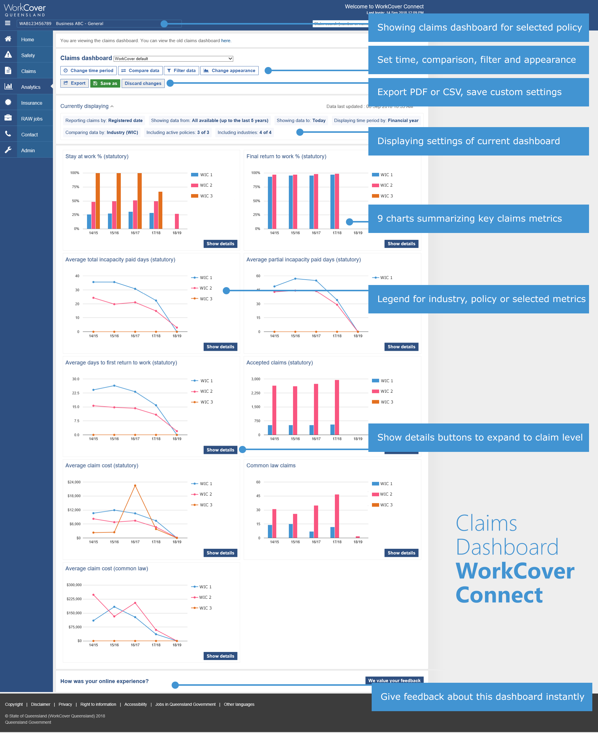
What's in the claims dashboard?
The claims dashboard provides nine graphs and charts measuring the following:
- Stay at work % (statutory)
- Final return to work % (statutory)
- Average total incapacity paid days (statutory)
- Average partial incapacity paid days (statutory)
- Average days to first return to work (statutory)
- Accepted claims (statutory)
- Average claim cost (statutory)
- Common law claims
- Average claim cost (common law)
Custom field support
If you're already using custom fields and have data against these, you'll see the flexibility of the dashboard already. A comparison dashboard can be created and saved for any custom field setup as a drop down with multiple values. These values can be compared against each other in the claims and safety dashboards.
Reporting measures
To make the most of the employer tools, we've standardised some aspects of how we report claims data across the various sections of WorkCover Connect. Employers using the existing reports may notice slight changes such as when the claim expenses are reported and industry averages. Costs can be analysed either by date of accident or the date of registration of the claim to assist you in working with these changes.
Using the dashboards
The flexibility of these features means there's endless combinations of how you can use the dashboards. We encourage you to click around on the features, change some settings and see how this impacts the graphs and charts. A help guide is available for some of the features of WorkCover Connect. If your question isn't answered here, please browse the pages below or contact your relationship manager for support to get the most out of the dashboards.